Yes Coach!
A successful businesswoman launching her life coaching business in Washington, D.C. wants to expand her business and attract new customers.

The Design Challenge
Having found customers mostly by word of mouth, my client wanted a way to communicate the value proposition of her services to new customers. She was also managing all her appointments through phone or text conversations and wanted an easy way for customers to see her availability and make appointments.
What exactly is life coaching?
Reading the profiles on Expertise of the top 12 life coaches in the D.C. metro area, I observed three different value propositions for life coaching: motivational, strategic goal setting and skills development, and as an accountability source. In a more general sense, these life coaches help their clients tackle overwhelming goals. My client’s potential customer base includes anyone experiencing a disconnect between the life they would like and the life they currently have.
Directed User Interviews
“Other people always act like they know what they want to do, but I really have no idea. What if I don’t like anything enough to make a career out of it?”
– Atlanta resident, Female, Age 29
“I knew what I had to do, and I knew how to do it, but I still didn’t do it.”
– Atlanta resident, Male, Age 31
I surveyed nine people, ages 26 to 65, to understand their perceptions of and interest in life coaching. I also asked them what would help them achieve their goals. I found that 89% of respondents were interested in life coaching and 78% of respondents mentioned accountability.
User Persona: The Exhausted Overachiever
“It’s not that I’m demotivated per se, I just don’t know where to even start sometimes.”
 frankie cordoba
Pain Points
-
Skeptical of value: "Why should I see a life coach if I am already seeing a psychologist?"
-
Concerned about cost: "It seems like a lot of money up front to work with someone who might not even be a good fit for my personality or problems."
-
Short on time: "I wouldn't even know where to start catching someone up on my problems-- there is a big time investment."
Conclusions
- Three different key value propositions for life coaching emerged from my competitive brand analysis: motivational, strategic goal setting and skills development, and therapeutic. In my interviews, users wanted to be accountable to someone while working toward their goals. If my client emphasizes motivation, accountability, and strategy in service offerings, she can appeal to new customers.
- Most people are at least casually interested in life coaching, but many mentioned being short on time and money. If my client offers a free consultation that’s fast and easy to sign up for, she can turn casually interested people into return customers.
Branding
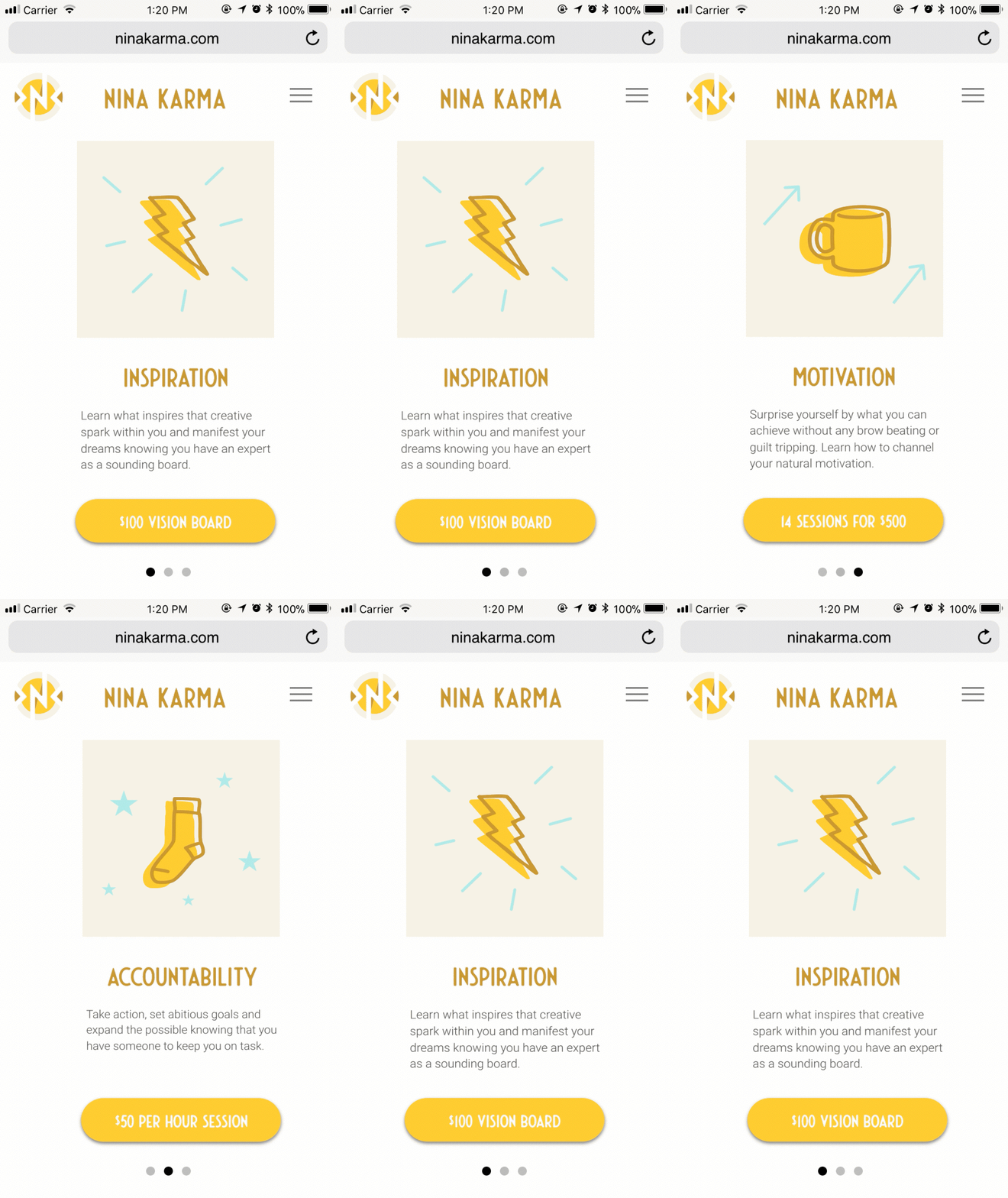
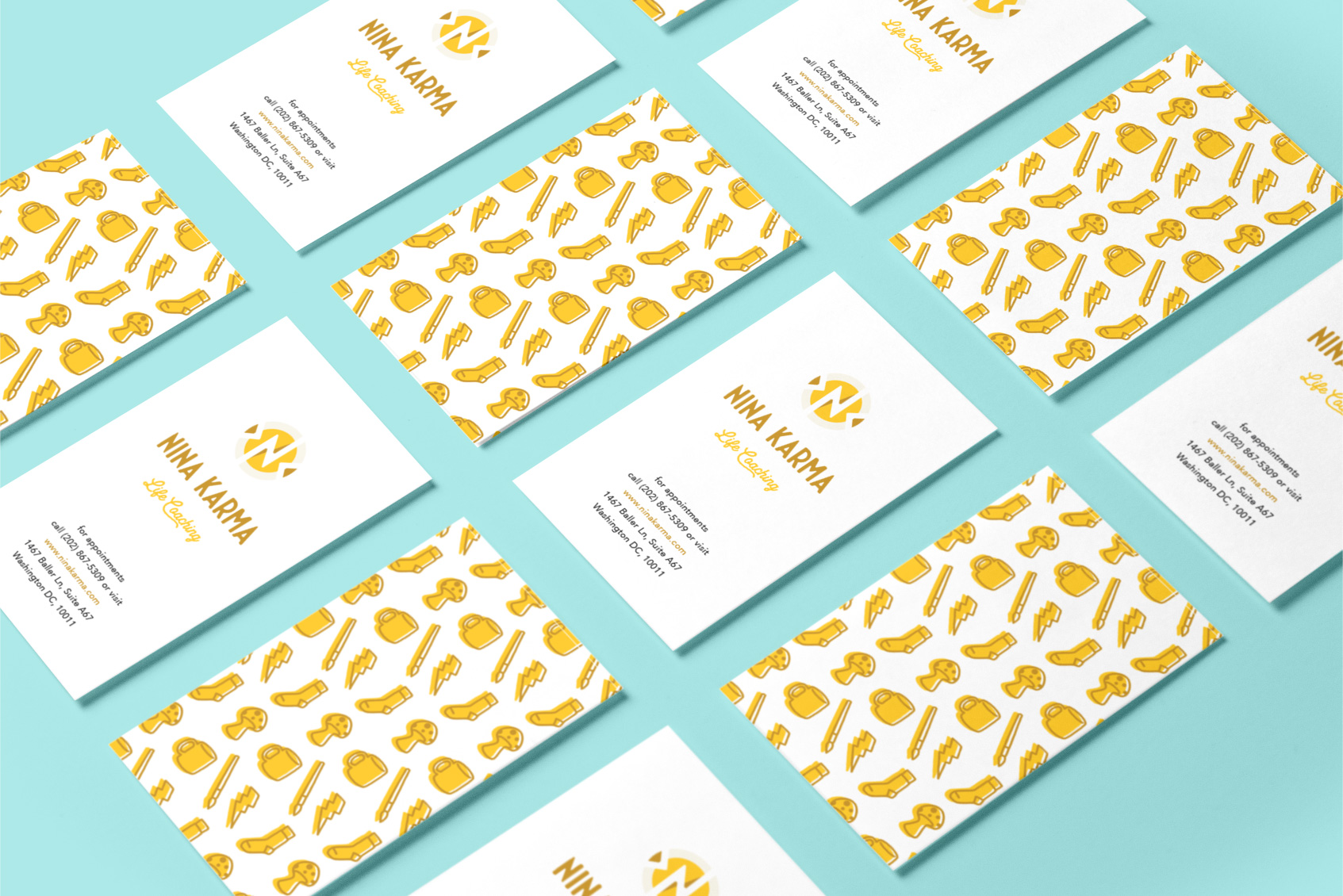
After conducting my research, I spent the first two weeks iterating with my client on logo design and branding. We wanted her customers to feel confident, comfortable and empowered to tackle any challenges that inspired them to seek life coaching. Also, we wanted lighthearted brand imagery to differentiate my client from the stock photos of tree-lined parkways, disheveled notebooks, and meditating women featured on her competitors’ websites.
A bright color palette, custom SVG illustrations, and straightforward typography highlight my client’s warm and empathetic approach to life coaching.

Prototype
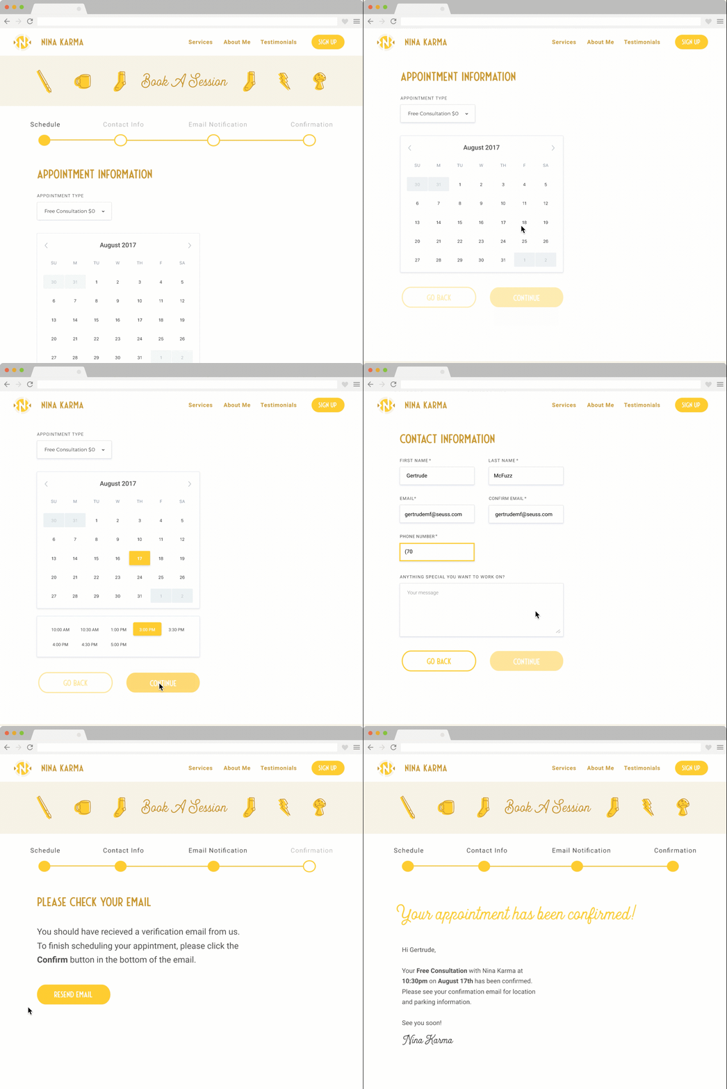
After settling on a brand-mark and icon set, I created a single-page microsite prototype that highlighted my client’s service offerings, testimonials, and included a scheduling interface. I used Ryan Singer’s shorthand to design my user flow and then created mockups in Figma and Principle.


User Testing
Three users tested two different prototypes by moving between static wireframe images.
“Wait, is that an angler fish? Do you know how those things reproduce?”
“I like the interface, but I think your lightest yellow might be too light as a background.”
“No offense, but the animation is giving me vertigo.”
Conclusions
- Users were unsure of whether they would remember to confirm their appointment via email.
- Users preferred a more clickable scheduling interface to my initial single page prototype.
- Users liked being able to see my client’s availability before submitting any information.
- There was not enough information about my client herself. Users wanted to see more than one photograph of her.
